You may have also noticed
Preface
Besides removing all the cover images on the site1, you may have noticed the change in logos2, colours, and various other details. As the saying goes: “There is a method to my madness.” (Yes, really!)3
What have you done
Logos
Let’s start with the logos. I changed the ‘favicon’ (which is what you see on the browser tab) because I wasn’t happy with a tiny, low resolution picture of my head as a logo. The biggest reason for that is that was to hard see in the browser tab. The other reason I wanted to change that, is I felt/feel like it was is a bit egotistical for a site icon.
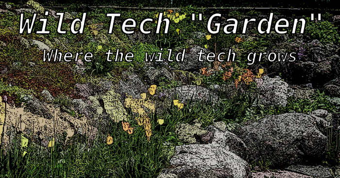
The home page ‘social card’ picture (below) and the logo in the top left on a large screen (or when you click the hamburger icon4 on a mobile device or narrow window) and also shown below were changed to be more ’tech’-y than just a picture of a wild rock garden.


Colours
Altering the colour scheme I did for a simple reason; so that scheme better matches the logos and ‘social card’ top banner (which is from the logo) while maintaining contrast and a somewhat ‘bluish’ feel.
Other changes
Human casing
Another major change you may have noticed is that I have moved all page titles to what I call ‘human’-case5 rather than ’title’-case6, for two reasons:
- I think it is easier to read (and therefore more accessible).
- In auto-generated lists it reads better than a collection of title-case page names.
This is not a universal (or likely even common) opinion about titles and casing, and given a better argument than “it is tradition” (which is often a fallacy people make when they are trying to apply the principle of least surprise7), I may change this back.
I will also be using the ‘human-casing’ in new articles, but I don’t have plans to go through every old article and change the casing of the titles (though I have changed some), as there are too many articles for this to be reasonable.
Moved ‘Building’, ‘Ops’, and ‘Academic’ under ‘Docs’
In addition to other re-organization under these (now) sub-headings, it makes it easier/more intuitive to browse the ‘Documentation’ sections. It became possible to use this type of organization with some changes and additions to page and feed layouts and styling. You’ll notice that, for example, the Docs top-level uses a layout I call ‘sectionmap’8.
Mass ‘metadata’ updates
Because of the change in organization and more pages (intentionally) being included in my RSS feeds, combined with the auto-generated ‘social cards’ the description and summary for ‘many, many’ pages have been updated. In addition pages that are ‘sectionmap’s (above) or ‘summary-list’ (like the ‘Blog’ list of articles) have had tags and series ‘taxonomies’ removed. That was done for better RSS feeds, ‘sectionmap’ pages, and ’taxonomy’ (e.g. tags or series) page lists.
While we’re here, we might as well…
As for other details: Most of of them fall in the category of fixing styling or things that didn’t quite work the way I wanted.
Although in some cases the former cover image was added into the body of the article or page. ↩︎
Including the one you see in your browser tab and/or recent pages icons on your ’new tab’ page (if you have your browser configured to do that; it’s the usual default these days). ↩︎
Ok, this madness. If you really want to hear about true madness, on my personal blog I have a piece called Princes and Madmen and a presentation/talk about Schizophrenia ↩︎
This one: ↩︎
That is titles looks like sentences (Only the initial letter, and proper nouns and acronyms are capitalized) ↩︎
“The Way Death Talks in Terry Pratchet’s Discworld Novels” (basically all words, except (sometimes) words like ‘is’ and ‘in’9, have an initial capital letter) ↩︎
The ‘Principle of Least Surprise’ really means that if one is new to an interface (or type of interface) that it behaves the way one would reasonably expect; not that the interface behaves the same problematic way as software invented before the the web was readily available, for those who have been computing for æons. ↩︎
As it is for sections and based on the HTML sitemap, with better styling. ↩︎
And even lower casing connectors is sometimes viewed as ’letting your hair down’ for True Title-case adherents. ↩︎